There are few things that I enjoy as much as eating Chocolate Cake, and one of them is looking at before and after house photos. Delicious. Looking at house photos must trigger the same part of my brain as eating chocolate cake. I love it. And I hope you will enjoy my bedroom before and after as much as I do.
Before the 1980’s in Tucson, almost all of the houses were built with brick (or “block”), and were ranch style. (Nowadays I would say that the trend here is mostly two story stucco houses with tile roofs.) I was so curious about why these older houses were all brick and one story that I read a 100 page article about it. And the reason is simple and heart warming. They used clay and concrete because there were no trees here for building. The cost of bringing in lumber was too high. So they used what they had: clay and concrete. I love this for a several reasons. I love how it’s environmentally friendly. I love the look of brick exteriors, both painted or unpainted. I love the look of interior brick walls. Also, I love how all of these brick walls are (I assume) mold proof. I have suspected mold in the drywall in previous homes we’ve lived in, and I love the thought that that doesn’t happen with these brick walls.
And the reason why they only built ranch houses before the 1980’s is super cute—so as not to block anyones views of the mountains which surround us. I mean, how cute it that?! And after I read this I peered out my front windows from the couch where I was sitting in my living room. I looked at the mountain views I adore, and then I looked down at the house across the street from us. I imagined the house across the street as a two story, and it’s true—if my neighbor’s house was two story I would not have any view.
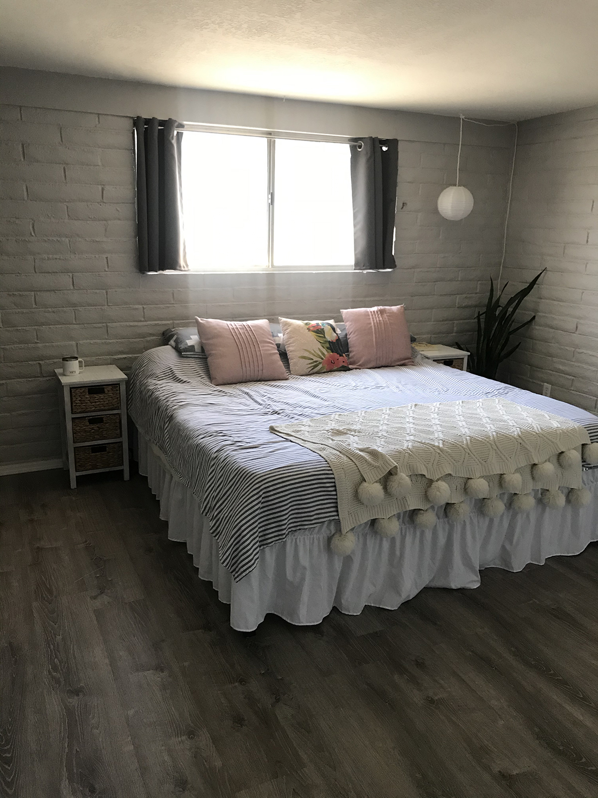
Bedroom Before
The house flipper who sold us this 1971 brick ranch painted all the inside walls grey, and put in grey floors. The only room that I didn’t like in grey was our bedroom. The bedroom was dark and Andrew said that the grey bricks in the bedroom reminded him of a prison cell. You can laugh, I think it’s funny 
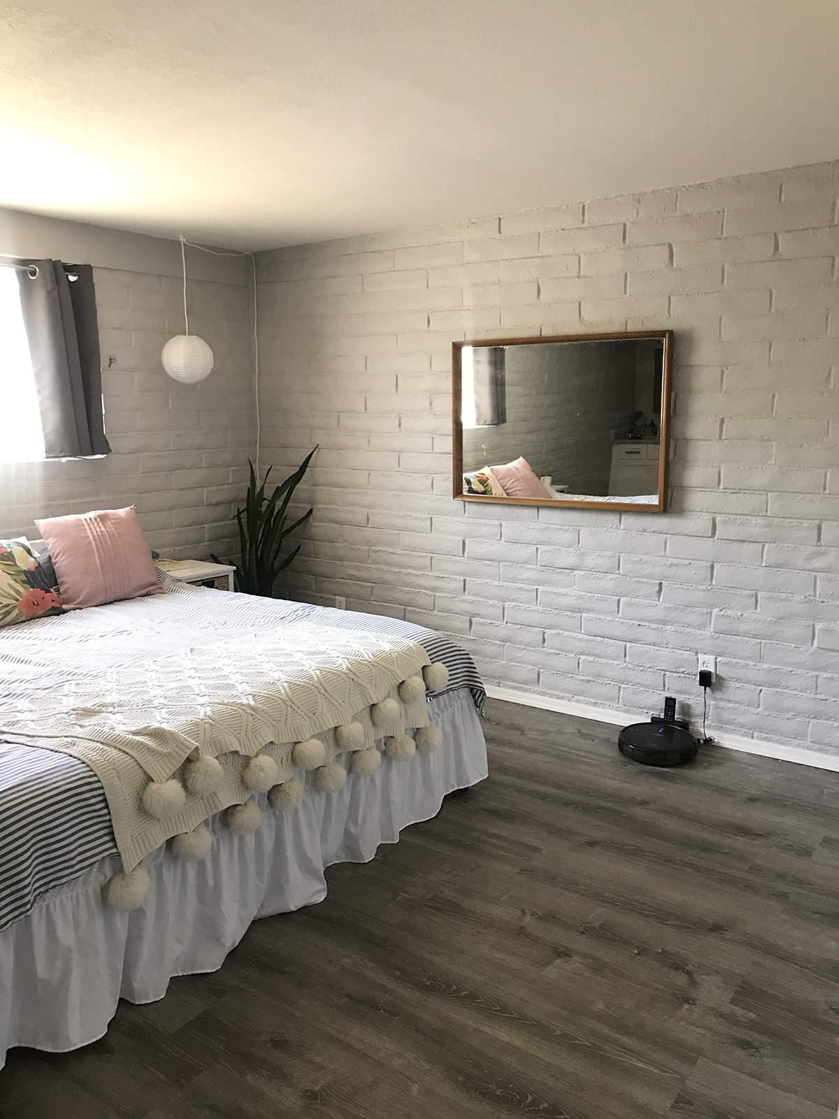
Bedroom Before
I was so focused on the rest of the house that I ignored the bedroom for months.

When I was ready, plan in mind, we began by painting our bedroom the same off-white as the closets and doors, but in eggshell instead of semi-gloss. You can see how much it brightened our small bedroom.
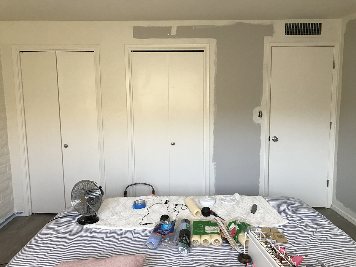
And since we aren’t replacing the closet and bedroom doors any time soon, I love how painting the walls the same color as the doors makes the doors just disappear. Well, somewhat anyway. At least the doors don’t stand out so much.
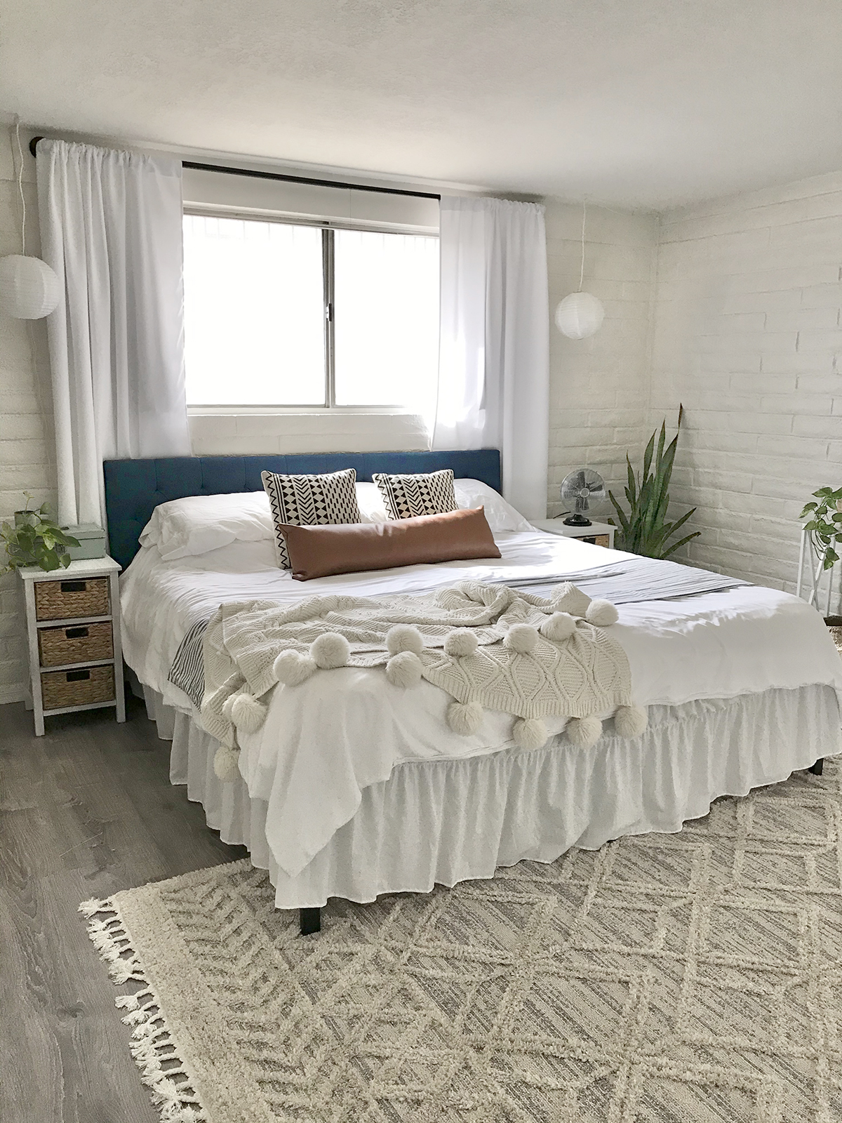
After the painting came the fun part, the decorating. I had already placed the bed on the window wall, because it’s a king and the window wall is longer, but it needed some dressing. I disguised my off-center placement of the bed under the window by hanging these curtains from my favorite modern rods. The curtains hide the edges of the window so that you don’t realize how the bed isn’t centered below the window. The curtains have a second purpose too: they also hide the short room darkening curtains seen in the before photos. I love how the curtains, hung as high as possible, give some nice vertical lines to that wall, which looked very horizontal and flat before adding them.

I found the blue headboard in one of Wayfair’s open box deals—a king headboard for just over $100! I hadn’t planned on doing a blue headboard, but I had a feeling that the blue might really work, and it did. To give the bed more yummy layers I folded my old striped duvet cover as an accent to the new white duvet cover. I added some geometric black and white pillows that lived on my white couch in the last house, as well as my existing oversized knit throw. Because my design is all about shades of white with lots of texture, I also added a leather bolster pillow. (Sidenote: I wish I could find a link for this vintage inspired tabletop fan for you, because I think it’s so damn cute, but after searching and searching, I had to give up.)
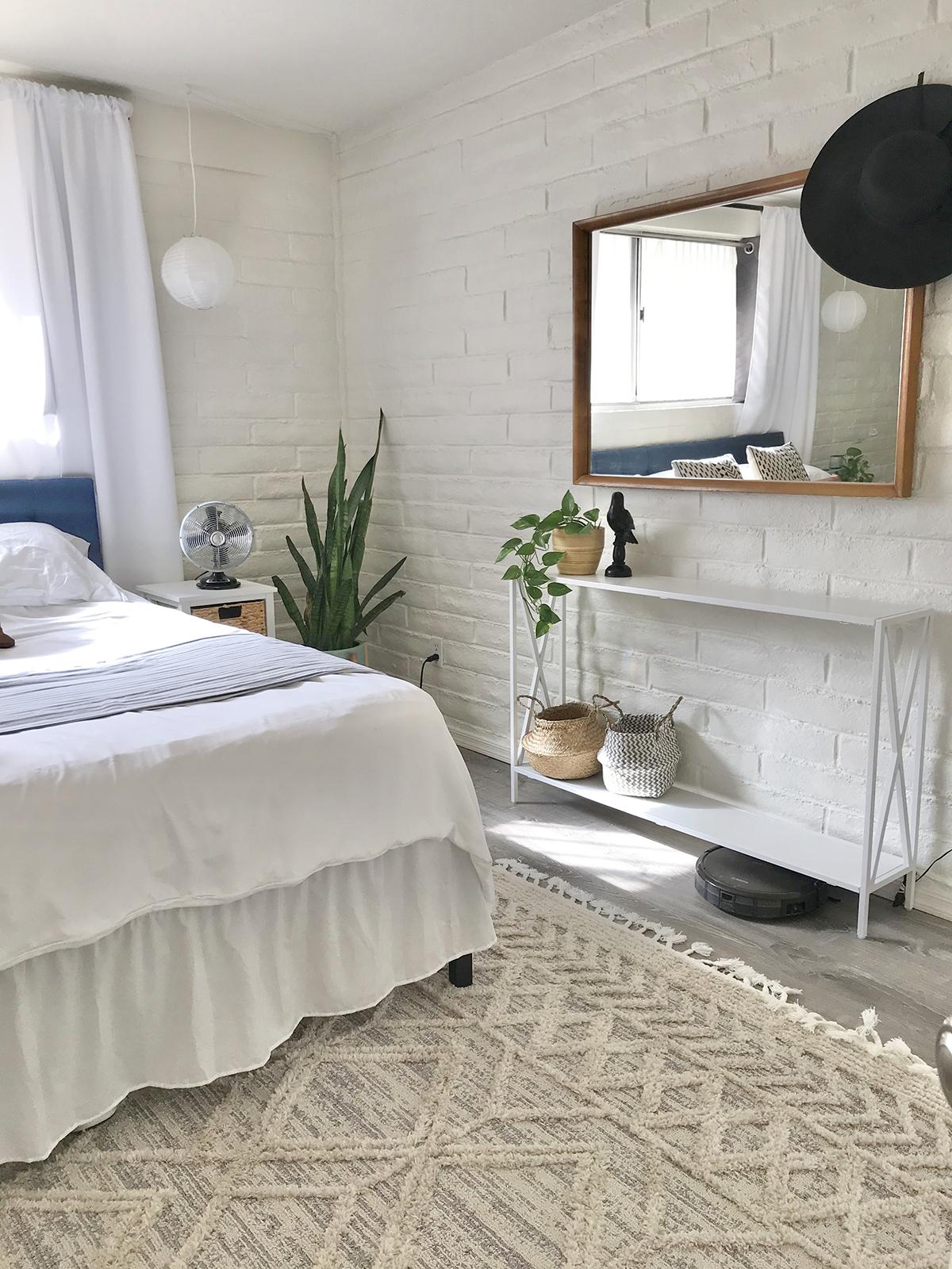
When you do a mostly monochromatic design like this it’s really fun to play with lots of texture. The texture, rather than color, becomes the highlight of the design. We have the texture of the brick walls, layers of smooth bedding, leather and woven pillows, and the knit throw. I wanted to add even more textures around the bed so I found this awesome and seriously soft area rug with tassels. This rug has varying height with it’s low and high woven lattice design. It’s sensational. And in addition to adding tons more texture the rug makes the room appear larger, because the white bed no longer seems to float on the grey floor. Suddenly you notice all the space between the bed and the closets.
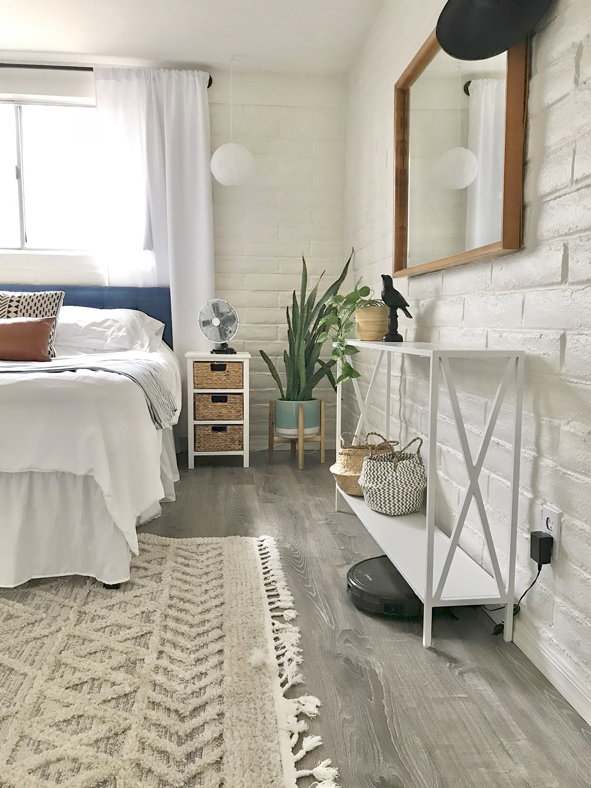
I about fell over when I saw these two small side tables in T.J. Max. They’re the exact hight of my mattress, which sits on a high platform bed so that we have loads of storage underneath (key in a small space like this). Three woven drawers on each table give us much more storage than our previous side tables, and I adore the blond natural woven fiber. So when I decided to add the narrowest console table I could possibly find to the windowless wall (to ground the 1950’s mirror that I found on Facebook Marketplace), I knew that I would place woven baskets on the lower shelf, to tie in with the woven side tables. This console table is also the perfect place to charge my laptop. Obsessed with it. Finally, I searched the thrift store to find a bamboo planter for yet another homegrown pothos, to keep with the blond color of the woven items.
(In case you’re wondering about my robot vacuum, DeeBot is the beeeeest. I haven’t vacuumed in years.)
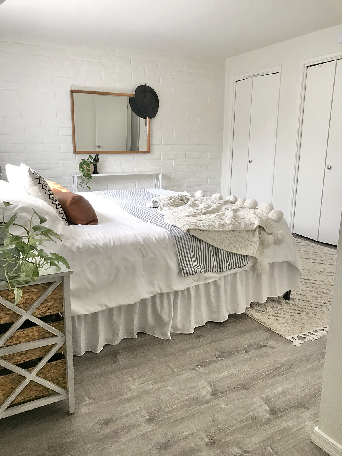
From this angle you can see how the closet doors are no longer such an eyesore. Your eye goes to the furniture and accents instead.
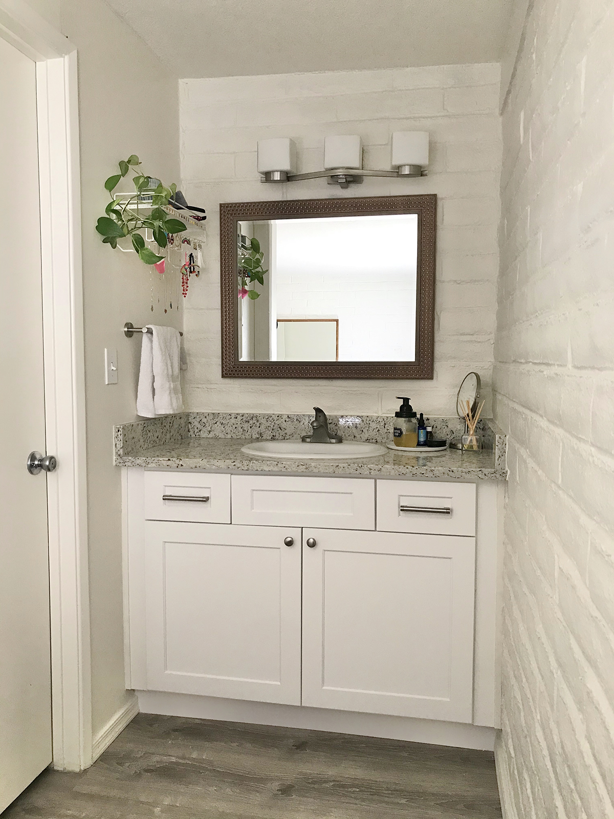
To the left of the bed is the vanity area and door to the shower area. I love how the house flipper installed the same white shaker style cabinets and granite counter in the bathrooms that he did in the kitchen. Andrew hung my copper mirror here for me, and I replaced the hand towel bar with one that I liked.
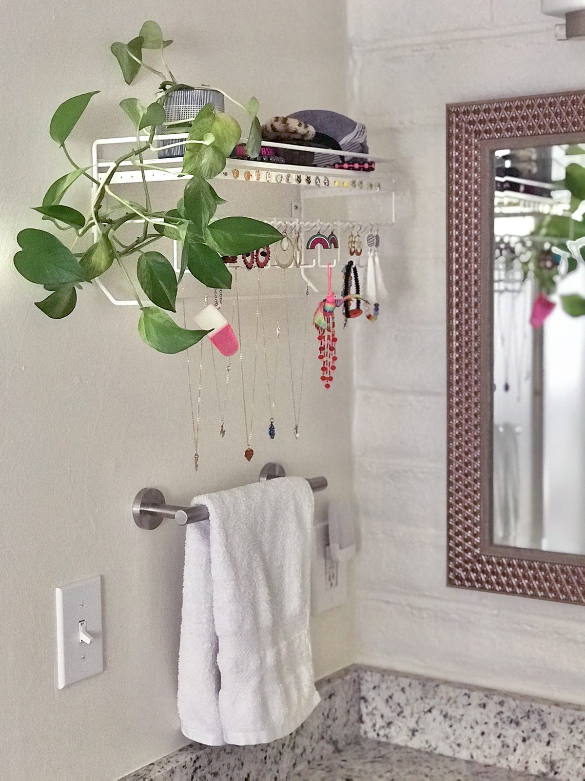
I also searched to find this jewelry organizer, and I love it here. It has a shelf for one of my pothos, and it makes me so happy to see my treasured objects hanging here, like the hummingbird made of beads that I got from an artist in Cancun, the hot pink photo “scope” of Zoe and Ashley when they were babies, my grandmothers necklace (that she got on a reservation here in Arizona), and the gold unicorn necklace that my mom gave me when I was little, plus a bunch of the earrings and necklaces that Andrew and I design.
I like to think that this room proves that modern and minimal design can be super cozy and inviting  It was so fun sharing it with you!
I have a few more tips to offer: I don’t actually put my comforter inside my duvet cover. I don’t have the time or the patience. I drape my duvet cover over the top of the comforter, and bonus: it hangs even longer this way, sans comforter inside. Also since we moved in I bought these organic cotton sheets, and they are my favorite sheets ever. The feel so good!! They are wrinkled when you take them out of the dryer, but I don’t care. You can’t see the sheets when the bed is made (I make my bed every morning) and what matters to me is that they’re healthy and so soft.
My last tip is area rug size and placement. When choosing the size of the rug consider what space the area belongs to. If the area rug is part of a seating area then it should be at least as big as the seating area. For example, if the rug is going in the dining room then it should be big enough that each dining chair fits on top of the rug, when the chair is not pushed all the way in. A chair that’s half on and half off of the rug feels uncomfortable. If the rug goes with a couch then it should be at least as wide as the couch, and long enough that at least the front two legs of the couch sit on top of the rug. In the case bedrooms, the rug needs to be at least as wide as the bed and deep enough that at least the foot of the bed can sit on top of the rug. The reason that the bed and the couch need to be at least partially on top of the rug is to visually ground the furniture in the space, and keep the scale of the space cohesive.
Please keep in mind that I only make a fraction of what I used to make from Amazon affiliate links anymore. I appreciate very much you supporting my other affiliate programs PrimeMyBody and Araza. I love you all!!
 , Kelly
The post Spunky Tucson Bedroom Redo appeared first on The Spunky Coconut.
